Our mission
Make Ortha teams look and operate like the best-run companies in their category.
 ortha.studioBrand identity
The Ortha Studio identity
A shared language for everything we make. The principles, tools, and details that make Ortha feel like Ortha.
Explore the guidelines Independent design & engineering
The identity starts with how we work. Every proposal, page, and post should come back to the same idea.
Ortha Studio is an independent design and engineering studio building websites, custom software, and AI workflows for mid-market teams in the US and Europe — delivered on retainer, by the people who actually do the work.
Make Ortha teams look and operate like the best-run companies in their category.
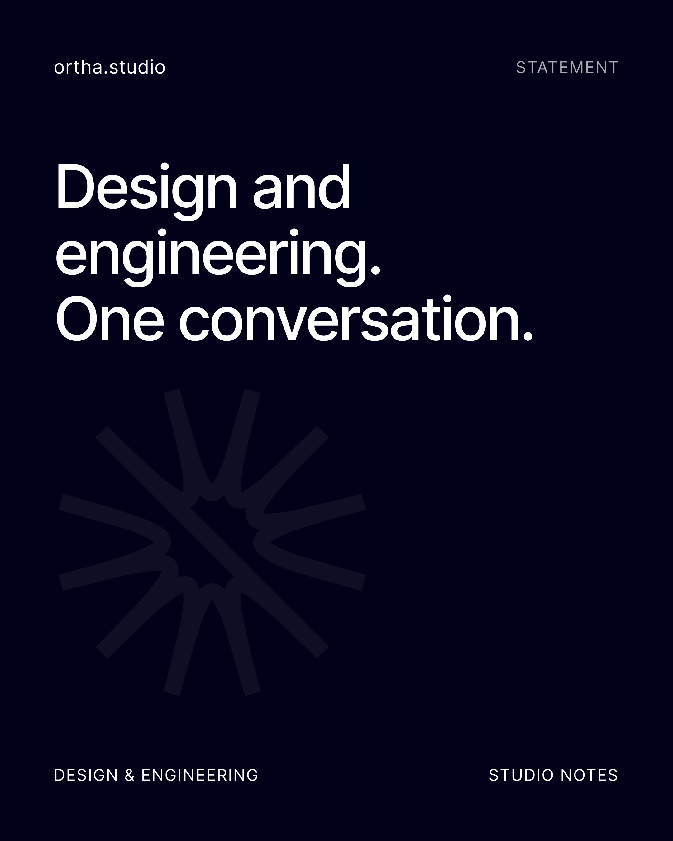
A studio where design and engineering are one conversation, not two invoices.
Mission and vision guide internal decisions. The source guidelines reserve them for that purpose, rather than the website hero.
One element carries the energy in any layout — the mark, the colour, or the headline. Never all three.
Clients see progress, not just outcomes. Working links beat status updates.
Scope is a promise. We do not bill for our own mistakes and we do not disappear after launch.
The work should be louder than the studio talking about the work.
Write the way a senior engineer talks to a founder they respect: short sentences, real numbers, and no superlatives we cannot evidence. Technical when useful. Plain the rest of the time.
“We rebuilt the booking flow and cut drop-off from 62% to 31% in six weeks.”
Illustrative copy from the guidelines; not a client result.“We craft transformative digital experiences.”
No hype, vague claims, buzzwords, or self-congratulation.The burst is output, signal, and ignition. Tapered strokes radiate from a common centre, cut by a single diagonal.

The primary horizontal lockup is the default for contracts, proposals, and headers. The logomark is for compact spaces or surfaces where the brand is already established. There is no stacked lockup.
Download the original logos ↓For the lockup, clear space on every side equals the cap height of the O. For the standalone mark, leave half the mark’s height on every side. Never redraw or re-space the supplied artwork.
| Asset | Digital | |
|---|---|---|
| Horizontal lockup | 160 px wide | 30 mm wide |
| Standalone mark | 24 px | 8 mm |
Set the mark at 56% of the canvas, optically centred. Follow the platform corner radius. Ink is the default ground; Violet is approved for light-mode-only contexts.
Use the mark alone. The export set is a 32 px SVG, a 96 px PNG, a 180 px Apple touch icon, and a 512 px maskable icon. Never use the wordmark at favicon scale.
Ink is the ground. Violet is the signal. The loudest color is used the least.
Select a swatch to copy its HEX value.
Deep Blue is the only secondary approved as a full-page ground. Pair it with White or Lilac; Violet on Deep Blue is illegible.
60%GroundInk, White, Paper, Deep Blue
30%StructurePaper, Graphite, Ink at 12%
8%SignalViolet: one primary action
2%SupportIris, Lilac, extended palette
Supporting colors are for illustration, charts, categories, and status. Never use them in the logo or as page grounds, and keep them below 10% of a layout. Set Ink on top.
Violet tints mixed with White. Keep the original color for primary signals.
Two stops, 135° by default. Use sparingly on large grounds. Never on type, behind body copy, or under the logo.
| Pairing | Ratio | Usage |
|---|---|---|
| Violet on White | 8.01:1 | AAA |
| Violet on Paper | 6.25:1 | AA |
| Ink on Iris | 5.06:1 | AA |
| Graphite on White | 4.83:1 | AA |
| Graphite on Paper | 3.77:1 | Large text only |
| White on Iris | 4.07:1 | Large text only |
| Violet on Ink | 2.57:1 | Do not use for text |
| White on Lilac | 2.55:1 | Do not use for text |
Three faces. Three jobs. Display carries the voice; text makes it usable; mono signals machine output.
Headlines, section titles, and display numbers. Light, Regular, Medium, Bold. Licensed; use Inter as the approved fallback when the font is unavailable.
Body copy, interfaces, labels, tables, and data. Regular, Medium, Semi Bold. Open source and free to embed. Use tabular figures for columns and metrics.
Code, paths, terminal output, versions, and ticket references. Regular, Medium, Bold. Never for paragraphs or marketing headlines. Ligatures belong in code editors only.
src/app/page.tsx · v1.0.0Display specimen · Inter, the approved fallback for Neue Einstellung
| Style | Typeface | Specification |
|---|---|---|
| H1 | Neue Einstellung | 72 / 100% / −2% |
| H2 | Neue Einstellung | 40 / 110% / −1.5% |
| H3 | Neue Einstellung | 28 / 120% / −1% |
| Body large | Inter | 18 / 150% / −0.5% |
| Body | Inter | 16 / 150% / −0.5% |
| Caption | Inter | 14 / 140% / 0% |
| Label | Inter | 12 / 130% / +9% caps |
Medium headings, Regular body. Sentence case in headings and buttons. Body at 16–18 px with 150% line height; keep lines under 75 characters.
Use weight for emphasis. Avoid italics, underlined emphasis, letter-spaced lowercase, justified paragraphs, and centred passages longer than two lines.
Structure comes first. Grids, icons, patterns, and imagery give the identity a consistent rhythm.
| Viewport | Columns | Gutter / margin |
|---|---|---|
| Desktop ≥ 1440 | 12 | 24 / 80 px |
| Tablet 768–1439 | 8 | 20 / 40 px |
| Mobile < 768 | 4 | 16 / 20 px |
Repeat the burst at low contrast on an 8 px lattice. Use it only as a ground, never over text or as a border. Maximum opacity: 40%. The Ink example uses a 22% White lattice with Violet accents at 1:3.
24 × 24 px canvas. 1.5 px non-scaling stroke, round caps, miter joins, and no corner radius. Ink by default; Violet for the active state.
The same identity, adapted to the surface. These specifications keep everyday materials consistent.
ortha.studioAn illustrative application of the Ortha identity.
85 × 55 mm with 3 mm bleed. 600 gsm uncoated stock. CMYK plus spot Ortha Violet. Soft-touch matt lamination, no varnish, square corners.
A4, 210 × 297 mm. 20 mm margins. Logo 8 mm high at top-left. 120 gsm uncoated white stock, one-color Ink. Source production type: Geist Regular 10/15 pt; Geist Mono footer at 6.5 pt.
One plain HTML block with a 32 px mark and a 3 px Violet rule. Name 20 px Medium; role and links 11 px. A single line of links. No quote, confidentiality paragraph, or social icon row. The source template specifies Geist with Helvetica Neue and Arial fallbacks.
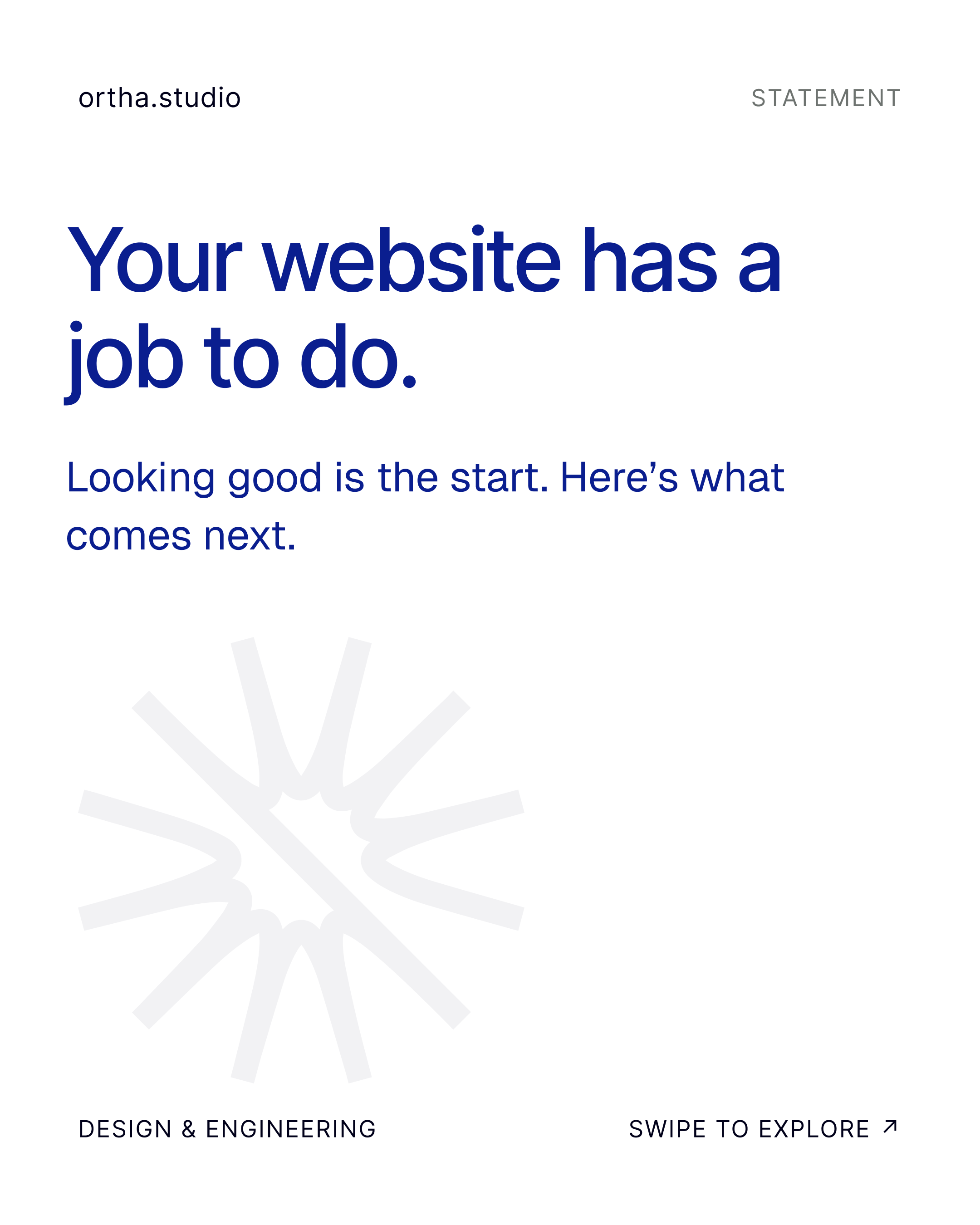
Statement, metric, or case note. Mark at bottom-left, 48 px. Copy at most four lines. Feed 1080 × 1080; portrait 1080 × 1350; story 1080 × 1920; LinkedIn 1200 × 627. At 1080, leave 64 px safe margins.
The source expression uses an Ink hero, Paper body, and one Violet primary button per view. Content width 1200 px; section padding 96/128 px; buttons 40 px high with 4 px corners. Links underline on hover. The Astra light theme is an alternate expression of this palette.
Full-bleed Ink. White logo top-left at 8 mm high. Client name large, scope beneath, date and reference in mono. No stock image. Source production type: Geist Medium 40 pt title, Regular 15 pt scope at 70% White, Geist Mono 10 pt reference.
Source note: the application boards retain Geist references, while the typography chapter specifies Neue Einstellung, Inter, and JetBrains Mono. Those original production notes are recorded above for clarity.
Start with the supplied artwork. Keep the master file close.
A portable brief with the brand story, exact colors, type rules, visual references, and ready-to-use prompts. Upload the Markdown file to an LLM. For image generation, attach the reference PNGs and the original logo too.
If your tool cannot open a ZIP, extract it and attach the files separately.
.svg)
Original SVG files supplied by Ortha, with artwork and filenames preserved. Neue Einstellung requires a licensed font file; this page uses the approved Inter fallback.